Some of the most rewarding work we have produced lately has been for clients in the third sector. We’re sure you’ll agree that there’s no better reward than when you can see how your input has made a real difference to people’s day-to-day lives.
One of our key projects in this sector has just seen some additions worth blogging about. We built a website for a great initiative, Campaign To End Loneliness a couple of years back. With some key additions recently and on an on-going basis we thought it be a good opportunity to let you know what we’ve been up to!
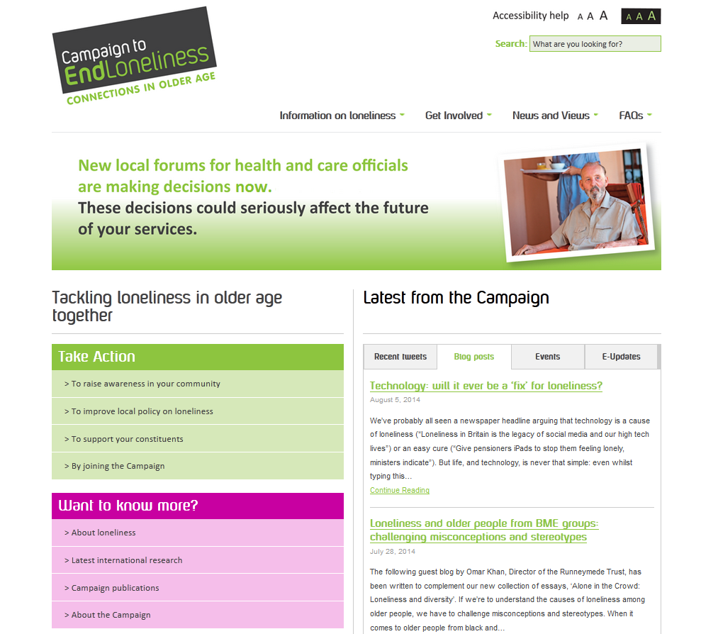
We have been involved in the build of CTEL’s new CRM functionality plugged in directly to their WordPress site. Built for easy management of all their charity contacts, Campaign to End Loneliness has now a powerful system they can use to record and segment users in order to create targeted lists to use in any external communication with their supporters.
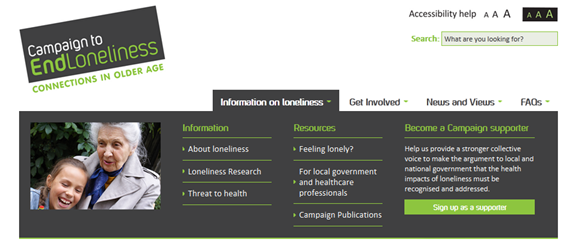
We’ve also added a mega menu – which beats standard drop downs by a mile these days – to improve user experience. These big, two-dimensional panels are divided into groups of navigation to help users understand at a glance what the website offers and helps structure their navigation choices, so there’s no need for scrolling or clicking. Below, you can see the button ‘sign up as a supporter’ on the far right as an example of how we integrated a call to action into the navigation, which at this position on the page helps ensure a high conversion rate. We’re also pretty big on design here (quelle surprise!), so as well as being functional, it was important to make a strong visual impact. It all adds up to a positive user experience.
Initially, the client came to us with a lengthy wish list and a ‘challenging’ budget, but with some clever thinking and a couple of coffee fuelled late nights, we delivered the first phase of a great website which hits all the key components of the brief.
This was to create an easily navigable, easily accessible website for older people, their families and potential corporate business partners. Creating a new media product for such a diverse range of people is always a careful balancing act; the site needs to look professional enough to attract potential sponsors, but not be too design-led as to alienate the core market of older people. It needs to be easy to use but also utilise interactive functionality to encourage younger audience engagement. In other words our challenge was to please ALL of the people ALL of the time!
As they say ‘the proof is in the pudding’, and we’re pleased to report we’ve got a very happy client, but we’ll let you see for yourself. Have a look at www.campaigntoendloneliness.org.
Let us know what you think!
Want to learn more about how we can build an awesome website which could benefit your business?
Let’s get together and explore the potential.
Contact us on +44 (0)20 8360 8244


